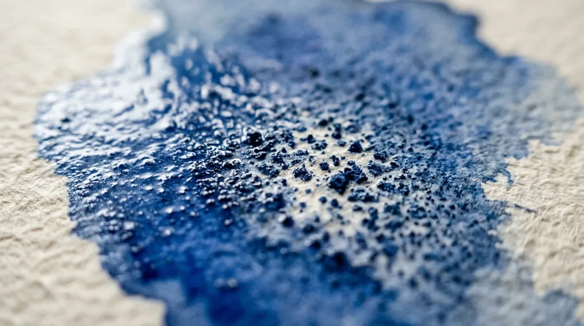
Watercolour granulation is the speckled, mottled texture that appears across a wash when heavier pigment particles settle unevenly into the tooth of the paper as it dries, rather than staying smoothly suspended in an even film of colour. Illustrators who work in watercolour often choose their palette specifically for this effect, letting certain blues and earth tones do the work that a flat wash never could.
The texture has been prized in watercolour painting for as long as the medium has existed, but it has taken on a fresh life among contemporary illustrators, who use it to suggest weathered stone, storm cloud, bark, or the grain of old paper without a single extra brushstroke. Rather than a flaw to be corrected, granulation has become a deliberate compositional tool — and understanding why it happens is the first step to controlling it.
Why Do Some Pigments Granulate More Than Others?
Granulation comes down to the physical size and shape of a pigment's particles. As the paper manufacturer Strathmore explains, pigments with "larger or irregularly shaped particles tend to granulate more, while pigments with small, round, homogenous shaped particles tend to granulate less." The heavier, coarser grains cannot stay evenly dispersed in the water film, so as the wash dries they sink into the tiny dimples of the paper's surface, clustering into visible flecks rather than settling as a flat tint.
This is largely a matter of chemistry. Inorganic, mineral-derived pigments tend to have larger and more irregular particles than modern organic, carbon-based synthetics, which is why traditional earth colours and cobalt-based blues granulate far more readily than the finely milled synthetic pigments developed for smooth, saturated colour.
Which Pigments Are Known For Granulating?
According to the art materials retailer Jackson's Art, the most reliable granulators are the ultramarines, the cobalts (including cerulean), and the earth pigments — raw sienna, burnt umber, raw umber and yellow ochre — along with ivory black and Mars black. French ultramarine in particular is noted as granulating more readily than some of its relatives, while naturally granulating red pigments remain unusual across the range. Illustrators building a granulating palette tend to reach for these families first, then pair them with smoother, non-granulating colours for contrast. Jackson's Art lists Cerulean Blue, Cobalt Blue and Ultramarine Blue Deep among the granulating colours worth keeping on a working palette, alongside the earth pigments above — a shortlist that covers most of what a landscape or texture-heavy illustration is likely to need.
How Does Paper Choice Affect the Effect?
Paper surface has a direct bearing on how pronounced granulation appears. Cold-press and rough watercolour papers have enough texture for pigment particles to settle into visibly, while hot-press or smoother mixed-media surfaces tend to mute the effect considerably. The paint manufacturer Winsor & Newton notes that "rough-surfaced papers accentuate granulated effects, as the pigment settles into the crevices of the paper," with medium-texture papers producing a more moderate result. An illustrator chasing a heavily textured, weathered look will generally reach for a rough-toothed sheet; one after a subtler shimmer will choose something smoother. Strathmore's own guidance echoes this: cold-press and rough surfaces "encourage pigment settling," while hot-press and mixed-media surfaces show far less pronounced granulation because there is less tooth for the heavier particles to catch on. The same pigment, applied to two different papers, can therefore produce two visibly different textures — a detail worth testing before committing a colour to a final piece.
How Can Illustrators Test or Control Granulation?
A simple test, recommended by Winsor & Newton, helps establish how any given colour will behave before it goes anywhere near a finished piece:
- Wet the paper thoroughly with clean water.
- Apply the pigment into the wet area, using a generous, well-loaded brush.
- Gently rock or tilt the paper, allowing the pigment to settle and pool as it dries.
- Once dry, compare the result against a smoother, drier application of the same colour to see how much the effect changes with water volume.
Water volume matters as much as pigment choice. Strathmore points out that when "a large amount of liquid is applied to the paper, the pigment particles can easily move around and settle," producing a more pronounced, blotchy granulation, while a drier brush restrains the effect into something finer and more even. Illustrators can also blend a granulating colour into a smooth, non-granulating one, tuning the proportion until the texture reads as subtle grain rather than heavy speckle — Strathmore notes that mixing the two produces results that shift with the ratio, so a small amount of a granulating blue folded into a flat wash can lend just a hint of texture rather than the full mottled effect.
For those working with pigments that granulate weakly or not at all, Winsor & Newton also produces a granulation medium, mixed with the paint in place of water, which is described as giving "a mottled appearance to colours that would normally have a smooth wash." Diluting the medium further with water lets an illustrator dial the effect up or down across a single piece, concentrating heavy granulation in a foreground rock face, say, while keeping a distant sky comparatively smooth.
Where Granulation Shows Up in Finished Illustration
Because the texture forms on its own as the paint dries, it rewards illustrators who plan their washes rather than fight them. A granulating blue laid loosely across a large area will read as weathered stone, an overcast sky, or the grain of old timber, all without additional linework. Many illustrators reserve their granulating pigments for exactly these passages, keeping smoother, non-granulating colours for skin, foliage, or any area that needs to stay flat and clean.
Winsor & Newton's own guide to the technique remains a useful reference point for illustrators building a granulating palette from scratch, setting out how paper, water and pigment interact before a single mark goes down.
For a related design perspective, read How Does Risograph Printing Actually Work?.